TUESDAY 08 Sep 2020
Intuitive Control Rooms
It's Just Too Clever For Its Own Good
Usability is the most important aspect of any control room. Why? Because if you don't have intuitive, user-friendly and flexible user controls and interfaces, then you're needlessly creating challenges for users. These challenges will, no doubt, affect output quality, and poor output often results in fewer subscribers and viewers and possibly lower ad revenues. Here's why controls need to be intuitive:
• Control rooms are busy, dynamic and live environments where there's usually no time for working things out on the fly.
• Energy needs to go into the programme output rather than figuring out the controls.
• Intuitive user controls can help avoid or even eradicate human error.
• Smart user design enables technical support to be busy with more complex activities rather than supporting operators.
• Freelancers can get up to speed quickly to be effective.
• Intuitive controls reduce pressure on operations teams to shorten operator training to flying solo.
• As we're all getting used to self-op systems, those companies that can provide user-oriented, intuitive and straightforward solutions will win in the long term.
So if it's an obvious choice, why aren't more control rooms intuitive?
• Firstly, generally, control rooms are not designed by operators but by engineers. Often user interfaces are the last thing to consider. Most effort goes into designing systems and getting the functionality right. Often this is because the technical culture overrides users and service considerations. This, of course, can be overcome by strong leadership and an understanding that providing the right tools to users will improve overall facility performance.
• Secondly, legacy systems often create integration challenges, resulting in multiple systems being presented to the user. This is inevitable in evolving facilities. However, these challenges can be overcome with careful consideration and planning. The key is to focus on creating an effective single-user interface.
• Finally, there is a perception that providing additional user interfaces will increase costs. In this case, management needs to challenge their own thinking. This is because any increase in the upfront cost of making control rooms intuitive is easily offset by savings from flexible operating models, lower service credits and a lower turnover of staff. So what does this look like in practice? Let's take a look at one vendor's approach to providing intuitive, user-friendly controls in broadcast facilities. Densitron embodies the user-first approach that is often lacking in control room environments. Of course, other vendors are available, however, Densitron's products tick the box in so many ways, and as they are purely focused on the user, it probably won't be a surprise to hear they do this really well. Let's look at three recent projects that illustrate this.
if you don't have intuitive, user-friendly and flexible user controls and interfaces, then you're needlessly creating challenges for users
BBC Radio 1: Listen to users
The best examples of user-friendly systems perhaps, unsurprisingly, result from a total focus on the users' requirements. Unfortunately, this doesn't always happen. Perhaps, this is due to a lack of time to properly assess user requirements, users are not clear about what they want, or engineers feel that they already know what's required.
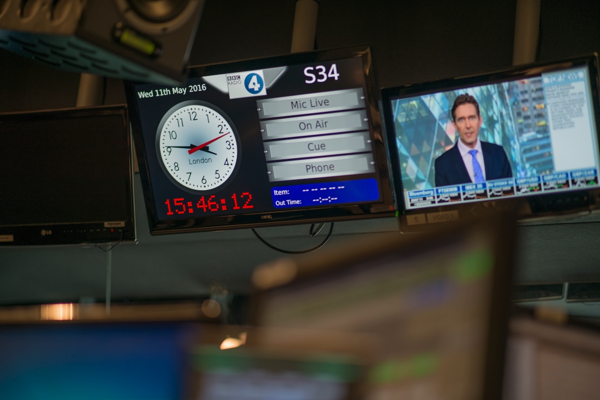
Densitron's recent installation at BBC Radio 1 illustrates this point nicely. A purpose-built suite of six on-air studios, news studios for Newsbeat and the famous 'Live Lounge' incorporates all the technology the users wish for. With this installation, the focus on providing the user with total control of their environment is embodied by a central Densitron touch screen with special features to make the most of the all-important online visualisation output, which incorporates lighting control and the ability to ingest material for display on large branding screens in each studio. This system provides the users with all the control they need at their fingertips. The lesson here is that only by thoroughly assessing the users' requirements and involving them from the start would such a user-friendly system have been successfully installed.

CNN: Make simplification a goal in its own right
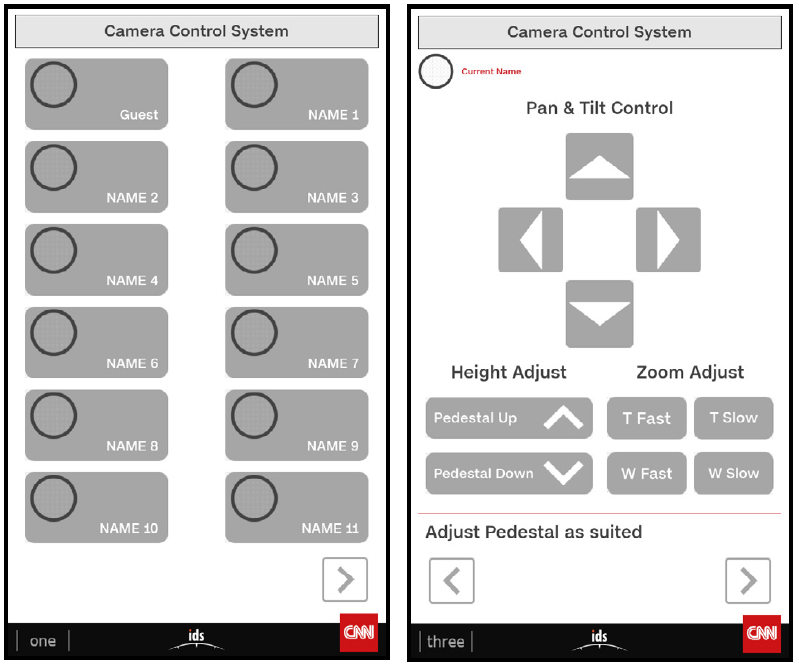
A key focus of Densitron’s CNN project was enabling a ‘self-op’ area for journalists. The technical team had recognised that technical resourcing was tight and that a user-friendly, intuitive set of tools would minimise the amount of support required and, therefore, free up the technical team for more demanding tasks. Self-op broadcast systems for journalists are not new. For example, self-operating satellite news-gathering trucks for journalists have been around for over 20 years. The reason the CNN project was such a success is that the team started out intending to provide a self-op area rather than just providing the necessary system functionality.
To achieve this, Densitron installed a touch panel system which provided a straightforward way for users to select and configure camera, lighting and sound equipment. Presets and defaults were used, which greatly simplified the user interface enabling anyone to use it, even those with no technical know-how. To operate the system, users simply press their designated button, and the Densitron IDS system automatically makes all adjustments to the camera, lighting, and sound from pre-set requirements to their presentation preferences.

Densitron installed a touch panel system which provided a straightforward way for users to select and configure camera, lighting and sound equipment
BBC World Service: Give users a single interface to multiple systems
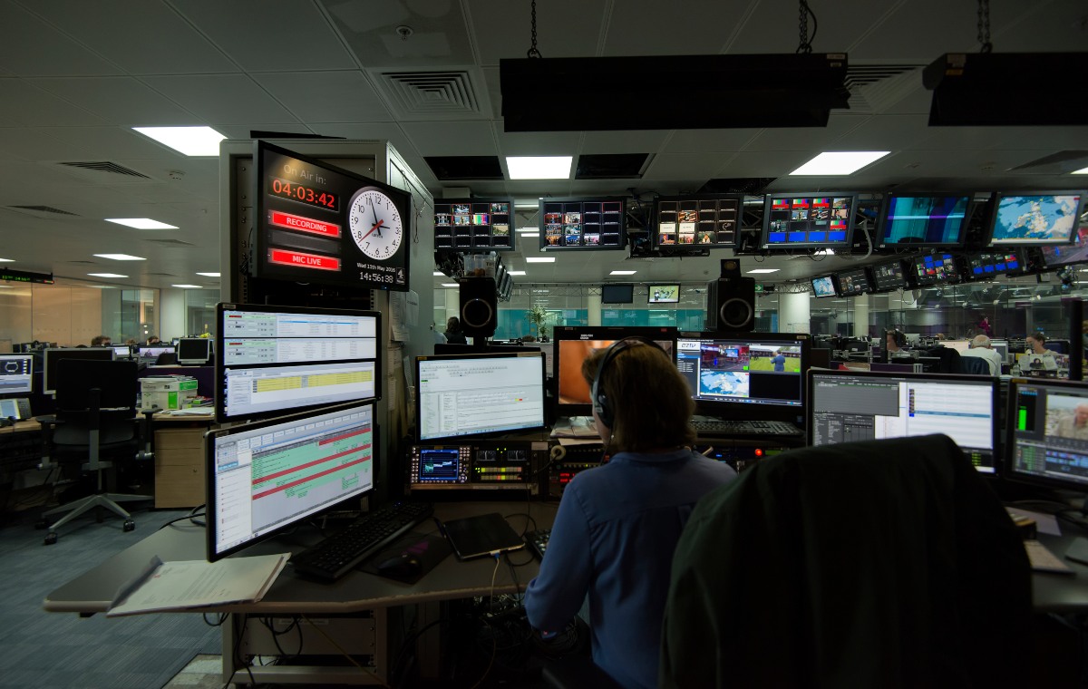
Most control rooms provide access to multiple systems. As new requirements are added, new systems are installed and operators are often required just to be able to pick it up. Unfortunately, this approach often results in overload when the number of systems and/or their complexity exceeds the attention of an operator. This often leads to a poor user experience, errors and compromised programme output. During a recent installation at the BBC Broadcasting House, Densitron integrated third-party equipment, including a legacy Pharos control system. This provided seamless control for the operator and resulted in control across all systems and an uplift in the user experience. The installation process was very smooth due to the intuitive nature of IDS and the fact that nowadays, people are much more used to working with touchscreen devices.

Conclusion
In conclusion, providing a great user experience is not difficult. Some areas to consider for a successful outcome for your next control room project are:
1. Listen to your users' needs and requirements.
2. Make simplification a goal in its own right.
3. Give users a single interface to multiple systems.
The benefits of a great user experience are clear: payback comes in the form of more flexible operating models, lower support costs, better programme output, lower training costs, better operator motivation and lower staff turnover. How often have you heard it said that it's just too clever for its own good? Don't fall into this trap. Take care of your users, and users will take care of the programme output.

Contact us
For more information about Densitron or any of our products and services please contact one of our regional offices or contact@densitron.com